Production is the often-invisible craft of taking creative ideas and making sure they survive contact with the real world — consistently, accurately, and without compromise across every medium.
Artworking: Where Design Becomes Real
Artworking is the quiet, unglamorous part of graphic design that most people don’t see, but it’s where good ideas either survive contact with reality or fall apart.
It’s the stage where design stops being conceptual and starts being practical. Where typography, spacing, colour, and layout have to behave under real-world constraints. Print tolerances. File formats. Accessibility requirements. Production timelines. Budgets.
A design can look perfect on screen and still fail completely if it hasn’t been properly artworked. Text can reflow unexpectedly, colours can shift., assets can export incorrectly, margins that felt generous suddenly look tight. A logo that worked beautifully at A3 becomes unreadable on packaging or social media.
Artworking is about anticipating those moments before they happen.
It’s the discipline of asking uncomfortable but necessary questions. How will this be used? Where will it live? What happens when it’s resized, translated, printed, compressed, or handed to someone who wasn’t part of the original design process?
Good artworkers think several steps ahead. They understand how different output methods behave and they design defensively. They build in tolerance. They test edge cases. They make sure files are named properly, organised logically, and handed over in a way that won’t cause panic two days before a deadline.
It’s also where consistency lives or dies. Brand systems don’t survive on moodboards alone. They survive because someone has taken the time to define spacing rules, typographic hierarchy, image treatment, and usage guidelines that actually work across formats.
Artworking isn’t a lesser skill than concepting. It’s a different one. And in many ways, it’s the difference between design that looks good and design that works.
Formatting Media for Different Uses: One Design, Many Realities
One of the biggest misconceptions in design is the idea that a single layout can simply be “resized” for different outputs.
In reality, formatting media for different uses is an act of translation, not duplication.
Print, digital, and social media each come with their own rules, behaviours, and limitations. What feels balanced in print may feel heavy online. What works in a landscape brochure may collapse entirely in a portrait mobile feed. What’s readable at A4 may be illegible on a phone held at arm’s length.
Print is static. It rewards detail, hierarchy, and subtlety. You can rely on the reader’s attention for longer. You can use smaller type, finer lines, and more complex layouts, because the viewing conditions are controlled.
Digital design is fluid. Screen sizes vary. Users scroll, skim, and abandon. Contrast, spacing, and clarity matter more than finesse. Files need to load quickly. Type needs to be readable in poor lighting, on cracked screens, with notifications constantly pulling attention away.
Social media is more brutal still. You have seconds. Sometimes fractions of a second. Designs need to communicate instantly, often without sound, often cropped unpredictably, often viewed alongside a flood of competing content.
Formatting properly means accepting that each medium deserves its own treatment.
It means rethinking hierarchy, not just resizing it. It means simplifying messaging for social while allowing depth in print. It means understanding how compression will affect images, how platforms handle colour, and how text may be truncated or obscured by interface elements.
It also means designing systems, not one-offs. When assets are built with flexibility in mind, adapting them becomes faster and more consistent. When they aren’t, every new format becomes a firefight.
Good formatting respects the context the design will live in. It meets users where they are, rather than forcing a single aesthetic across every surface.
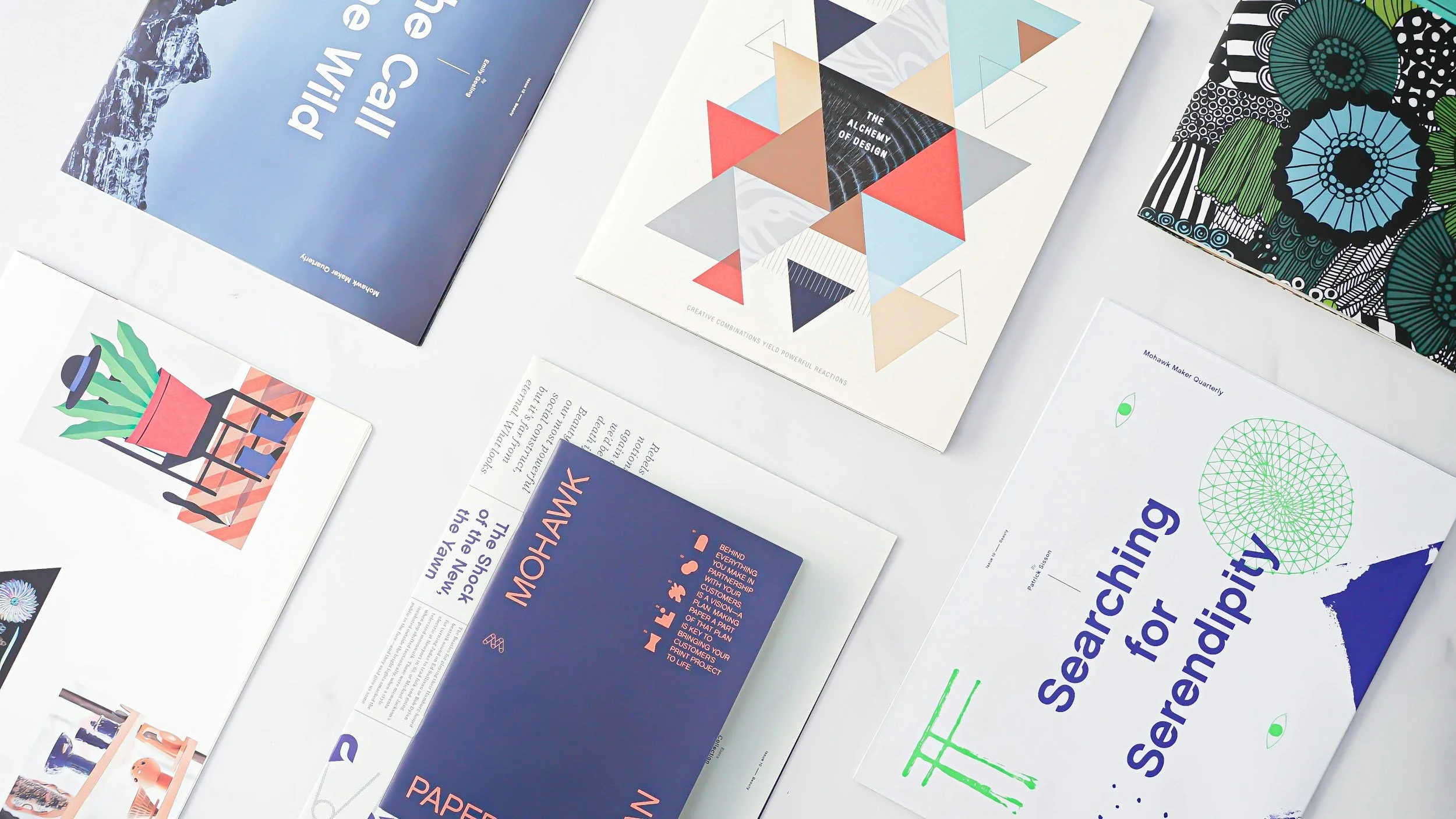
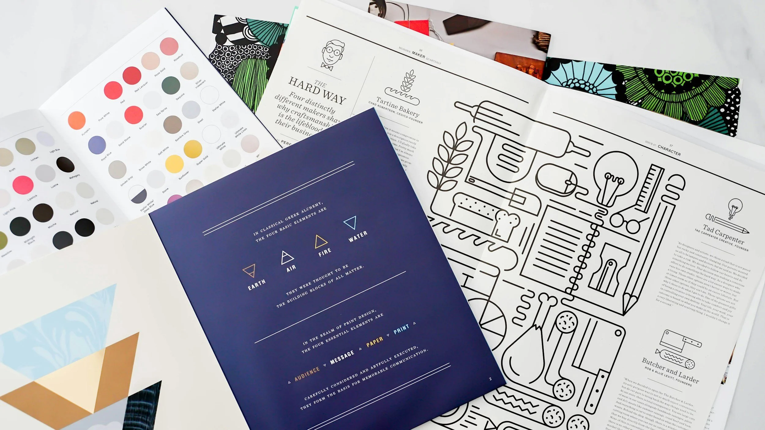
Print Management: The Bit That Still Matters
Print may not be as fashionable as it once was, but it still matters. And when it goes wrong, it goes wrong loudly and expensively.
Print management sits at the intersection of design, production, and logistics. It’s where creative intent meets physical reality.
Paper stocks behave differently. Finishes affect colour. Ink coverage matters. Bleed, trim, and creep are not abstract concepts, they are physical constraints. A design that hasn’t accounted for them risks being compromised the moment it comes off the press.
Managing print properly means understanding the full lifecycle of a printed piece. From file setup and colour profiles through to proofing, production schedules, delivery, and storage.
It means knowing when to use spot colours versus CMYK. When to simplify a design to avoid registration issues. When to push back on a concept that won’t survive the production method it’s destined for.
It also means communication. Printers aren’t magicians. They need clear specifications, well-prepared files, and realistic expectations. A good designer builds relationships with print suppliers and understands their processes, rather than treating print as a black box.
There’s also an environmental and ethical layer now that can’t be ignored. Paper choice, print quantities, finishes, and distribution all carry impact. Thoughtful print management isn’t just about quality, it’s about responsibility.
Print has a permanence that digital doesn’t. When it’s done well, it carries weight. It’s tactile. It’s considered. But that only happens when the design has been managed with care from start to finish.
—
From concept to final output, details matter.
If you’re looking for a designer who understands both creativity and production, I’d love to hear from you.