For a lot of small businesses, “brand guidelines” can sound like something reserved for huge companies with endless marketing budgets and entire creative departments.
In reality, they’re one of the most useful things a growing business can invest in. Not because they make you look corporate, but because they create consistency. And consistency builds trust.
I often find that when a business starts out, branding happens organically. A logo gets made. A website follows. Social graphics appear somewhere along the line. Maybe a brochure. Maybe packaging. And over time, the visual identity starts to drift. Colours change slightly. Fonts become inconsistent. Messaging shifts depending on who’s writing it.
That’s usually the moment when brand guidelines become necessary.
Not as a restrictive rulebook, but as a framework. A way of documenting the visual and verbal identity of a business so that everything feels connected, recognisable, and intentional.
Because branding isn’t just about appearance. It’s about clarity.
So, What Are Brand Guidelines?
At their core, brand guidelines are a reference document. They explain how a brand should look, sound, and behave across different platforms and materials.
Think of them as the instruction manual for your business identity.
A designer creates them to ensure that whether someone is designing a social media post, building a website, printing a business card, or writing an email campaign, the brand still feels like you.
Good brand guidelines help answer questions like:
Which logo version should be used where?
What colours represent the brand?
Which fonts create the right tone?
How should imagery feel?
What kind of language should the business use?
What should be avoided?
Without guidelines, every new piece of design becomes a fresh interpretation. With guidelines, the business develops a recognisable visual language.
And that matters more than people realise.

Step 1: Understanding the Business
Before any colours or logos appear, a designer usually starts with questions. A lot of questions. Because good branding isn’t decoration. It’s communication. The designer needs to understand:
Who the business is for
What problem it solves
What makes it different
What personality it has
How it wants people to feel
Who its competitors are
Where the brand will appear
This stage is often called discovery or strategy. And honestly, it’s one of the most important parts of the process. You can usually tell when branding has skipped this stage because everything looks nice, but nothing feels specific. It could belong to almost anyone. Strong branding feels aligned to the business itself.
Step 2: Defining the Brand Personality
Once the strategy is clearer, the designer starts shaping the personality of the brand. This is where tone, mood, and positioning start to emerge. Some brands want to feel:
Warm and human
Premium and refined
Bold and disruptive
Calm and trustworthy
Creative and expressive
Minimal and technical
This personality influences everything that follows. Typography. Photography. Colour choices. Layout spacing. Animation style. Even the words used in headings. A good designer isn’t randomly choosing visuals they personally like. They’re building a system that reflects the identity of the business.

Step 3: Creating the Visual Identity
This is usually the stage clients imagine first, because it’s where the visible design work begins. The visual identity often includes:
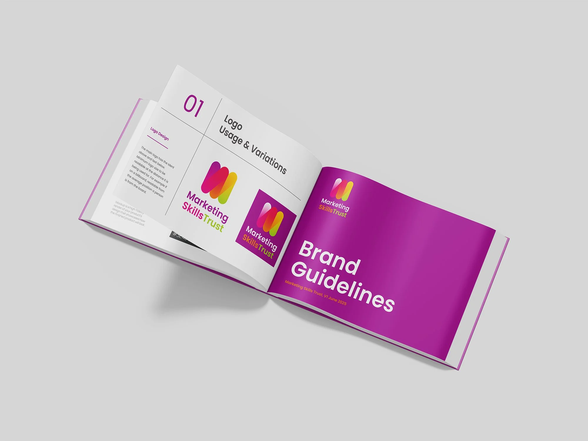
Logo Design
Usually there are multiple versions:
Main logo
Simplified logo
Icon or symbol
Light and dark variations
Horizontal and stacked versions
The idea is flexibility. A logo needs to work on websites, packaging, social media, print, and sometimes very small spaces.
Colour Palette
A designer selects a core palette that reflects the brand personality. This often includes:
Primary brand colours
Secondary supporting colours
Neutral tones
Accessibility considerations
Hex, RGB, and CMYK values
Good colour systems aren’t just aesthetic. They help create consistency across digital and print materials.
Typography
Fonts shape perception far more than people realise.
A modern sans-serif can feel clean and technical.
A serif can feel editorial or established.
Rounded typography can feel approachable and friendly.
Designers will usually define:
Heading fonts
Body copy fonts
Font hierarchy
Spacing rules
Web-safe alternatives where needed
Imagery Style
This section defines how photography and graphics should feel. For example:
Bright and natural
Dark and cinematic
Minimal and clean
Documentary style
Illustration-led
High contrast and bold
This helps future content remain visually cohesive.
Step 4: Building the Brand System
At this point, branding moves beyond individual assets and becomes a usable system. Because a logo alone is not a brand. A designer starts defining how all the pieces work together:
Layout structures
Grid systems
Icon styles
Button styles
Social media formats
Website UI direction
Graphic elements and patterns
This stage is especially important for digital brands because consistency across platforms creates familiarity. And familiarity builds confidence.

Step 5: Defining Tone of Voice
One thing many people overlook is that brand guidelines are not only visual. They also define communication style. This might include:
Writing tone
Vocabulary preferences
Sentence structure
Messaging examples
Social media tone
Words to avoid
For example, a law firm and a creative agency might both offer consultancy services, but the way they communicate should feel entirely different. Tone of voice creates emotional consistency. And when the visual identity and verbal identity align properly, the brand starts feeling believable.
Step 6: Delivering the Final Brand Guidelines
Once everything has been developed, the designer compiles it into a usable document. This might be:
A PDF brand book
An online brand portal
A presentation deck
Shared design libraries
Downloadable assets and templates
The final delivery often includes:
Brand Guideline Document
The main reference guide explaining the entire system.
Logo Files
Usually supplied in formats like:
SVG
PNG
EPS
PDF
With variations for digital and print use.
Font Information
Including licensing guidance and download links if needed.
Colour Specifications
For web, print, and accessibility consistency.
Templates
Potentially including:
Social media templates
Presentation templates
Email signatures
Business cards
Website components
Image Direction
Moodboards or photography references to guide future content.
Final Thoughts
The strongest brands are recognisable because everything feels connected:
The website
The packaging
The social media
The emails
The printed materials
The messaging
When all of those things align, trust increases naturally. Not because the business looks bigger than it is, but because it feels intentional.
Brand guidelines help businesses grow without losing their identity along the way. For small businesses especially, that consistency becomes increasingly valuable as more people get involved. Designers, developers, marketers, photographers, printers, social media managers , giving everyone the same reference point.
A good designer isn’t just creating a logo. They’re building a visual and communicative framework that allows a business to present itself clearly, consistently, and confidently across every interaction.
--
Abi Fawcus is a freelance UX Consultant, Website Designer, Logo Designer and Graphic Designer based in Woodbridge, Suffolk. Contact me for more information.